created with 💓by Amr kilany @Amrzlabs
Introduction
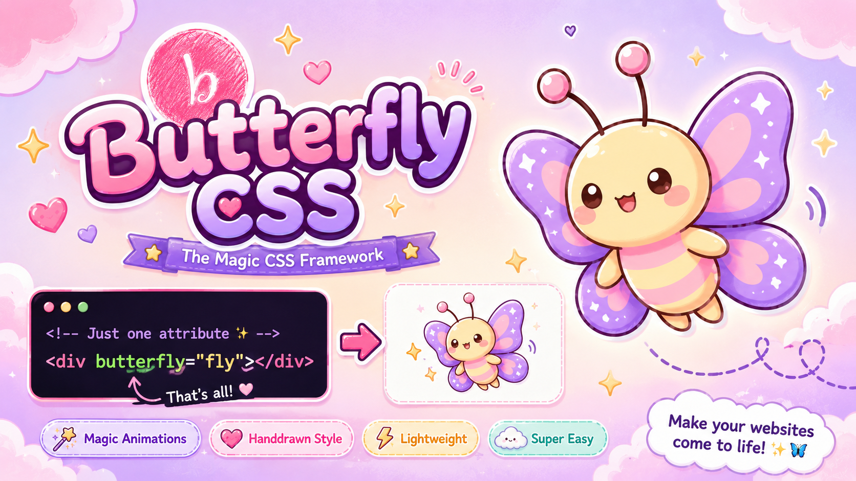
butterfly css is a new way to build websites that fly out of the box! by attribute-based fast typing
This documentation provides a comprehensive guide to all available attributes, from installation to detailed descriptions and examples you can see a demo for dark mode and birthday effect here
Installation
To use butterfly CSS, simply add tags in the <head> section of your HTML document,butterflycss.css is for base animations and features ,vf.js for height ,width,margin, padding handling&df.js for dark mode only
                    <link rel="stylesheet" href="https://cdn.jsdelivr.net/gh/AMR2010M/butterfly-css@latest/butterflycss.css">
<script src="https://cdn.jsdelivr.net/gh/AMR2010M/butterfly-css@latest/df.js"></script>
                    <script src="https://cdn.jsdelivr.net/gh/AMR2010M/butterfly-css@latest/vf.js"></script>
or get it on your device:
gh repo clone AMR2010M/butterflycss
For example, to make any thing turn into a butterfly :
<div butterfly='fly' ></div>
And for a button, it would be:
<button btn='purple' handdrawn>...</button>
Special Effects
These attributes apply unique visual effects to elements, often using pseudo-elements or SVG filters.
Creates a confetti-like falling paper animation over the element. The parent element should have `position: relative` and `overflow: hidden`.
<div style="..." birthday-paper></div>
Gives the element a hand-drawn or sketchy appearance using an SVG filter,(note it makes the element font very sketchy you can override the font family)
<div handdrawn></div>
Applies a `filter: blur(2px)` to the element.
<div blur></div>
<div style="..." butterfly='fly'></div>
responisive box
use it for any parent to make responive flex box(note use it if the childs are div only)
<section responsive>
                           <div >   </div>
                            <div >   </div>
                            <div >   </div>
                            </section>
Floating Ball Animations
These attributes create glowing, animated balls that float across the element using `::before` pseudo-elements. The parent element should have `position: relative` and `overflow: hidden` for best results.
A glowing ball animation with a specific path and speed.
<div style="..." ball-move-1></div>
Another glowing ball animation with a different path and speed.
<div style="..." ball-move-2></div>
A larger glowing ball animation.
<div style="..." ball-move-3></div>
A faster, smaller glowing ball animation.
<div style="..." ball-move-4></div>
A very large, slow glowing ball animation.
<div style="..." ball-move-5></div>
dark mode
Sets background to `dark purple`,if 'dark-btn' swithed to dark. and light purple if light
<div dpurple lpurple> </div>
for text color in dark,light mode.
<p dtwhite tlblue></p>

                            <button dark-btn btn='black' ></button>
for text color in dark,light mode.
<p dtwhite tlblue></p>

                            <button dark-btn btn='black' ></button>
  document.addEventListener("darkModeApplied", (mode) => {
    if (mode.detail.dark) {
        console.log("Dark mode is active");
        // custom dark mode logic
    } else {
        console.log("Light mode is active");
        // custom light mode logic
    }
});
Standard Animations
These attributes apply various continuous animations to elements. These are general-purpose motion effects.
Continuously rotates the element 360 degrees.
<div spin></div>
🌍
Makes the element bounce vertically.
<div bounce></div>
⚽
Makes the element grow slightly and fade in/out.
<div pulse></div>
💗
Makes the element wiggle from side to side.
<div swing></div>
🧹
Flips the element horizontally.
<div flip></div>
🃏
Makes the element shake horizontally.
<div shake></div>
😵💫
Makes the element continuously grow and shrink.
<div grow></div>
🐣
Makes the element continuously shrink and grow.
<div shrink></div>
🛰️
Slides the element horizontally left and right.
<div slide-x></div>
🛒
Slides the element vertically up and down.
<div slide-y></div>
🎈
Rotate Utilities
Apply specific rotations to elements. These attributes provide rotation in 1-degree increments from 0 to 360 degrees. Responsive variants are also available.
Rotates the element by the specified degree (e.g., `rotate="45"` for 45 degrees, `rotate="180"` for 180 degrees). Values are in degrees without units in the attribute itself.
<div rotate="45"></div>
Layout Utilities
Applies `display: flex` with `flex-direction: row`, and centers items horizontally and vertically.
<div rows>...</div>
Applies `display: flex` with `flex-direction: column`, and centers items horizontally and vertically.
<div columns>...</div>
Centers an item within its flex container (`align-self: center; justify-self: center;`).
<div flex-row><span center>...</span></div>
switches between flex-row and flex-column on with screen morre and less than 1200 px for layout not cards for example you can use if you want a text next to image on computer be text under img if you want responsive cards or divs see responsive box section
<div flex-auto> </div>
Width & Height Utilities
These attributes allow you to set fixed widths and heights for elements in rems.
Sets the width of the element from 1 rem to 999 rems. For example, `w-100` sets width to 100rem
<div w-150></div>
Sets the height of the element from 1 rem to 999 rems. For example, `h-200` sets height to 200rems
<div h-120></div>
Sets the width in percentage.
<div w-80p></div>
Sets the height in percentage.
<div h-90p></div>
Clip-Path Shapes
These attributes apply various geometric shapes using `clip-path`.
Clips the element into a perfect circle.
<div circle></div>
Clips the element into a triangle.
<div triangle></div>
Clips the element into an ellipse.
<div ellipse></div>
Ensures the element is a square clip path (inset 0).
<div square></div>
Clips the element into a rectangle (with 10% inset on top/bottom).
<div rectangle></div>
Clips the element into a diamond shape.
<div diamond></div>
Clips the element into a hexagon shape.
<div hexagon></div>
Clips the element into a parallelogram.
<div parallelogram></div>
Clips the element into a star shape.
<div star></div>
Clips the element into a trapezoid shape.
<div trapezoid></div>
Clips the element into a classic house shape.
<div home></div>
Clips the element into a heart shape.
<div heart></div>
Clips the element into an 'X' shape.
<div x></div>
Clips the element into a message bubble shape with a pointer at the bottom.
<div message></div>
Components
Button
A base styled button with padding, border-radius, background, and hover effects.
<button button>Click Me</button>
Predefined colored buttons. Replace `{color}` with a wide range of colors. Hover effects are included.
<button btn='purple'>Purple</button>
<button btn='green'>Green</button>
<button btn='rose'>Rose</button>
Background Colors
Set background colors using attribute selectors for basic colors and various shades (e.g., `red`, `red-500`). These apply `!important` to override other styles.
Basic Colors
Sets background to a vibrant red.
<div red></div>
Sets background to a vibrant pink.
<div pink></div>
Sets background to a deep purple.
<div purple></div>
Sets background to a darker purple.
<div deep-purple></div>
Sets background to an indigo blue.
<div indigo></div>
Sets background to a standard blue.
<div blue></div>
Sets background to a light blue.
<div light-blue></div>
Sets background to a cyan blue.
<div cyan></div>
Sets background to a teal green.
<div teal></div>
Sets background to a vibrant green.
<div green></div>
Sets background to a light green.
<div light-green></div>
Sets background to a lime green.
<div lime></div>
Sets background to a golden yellow.
<div yellow></div>
Sets background to an amber yellow.
<div amber></div>
Sets background to an orange.
<div orange></div>
Sets background to a deep orange.
<div deep-orange></div>
Sets background to a brown.
<div brown></div>
Sets background to a standard gray.
<div gray></div>
Sets background to a blue-gray.
<div blue-gray></div>
Sets background to a dark black.
<div black></div>
Sets background to white.
<div white></div>
Sets background to a very light purple/gray (`#f8f7ff`).
<div light></div>
Sets background to a dark gray/blue (`#22223b`).
<div dark></div>
Shaded Colors (e.g., `red-50` to `red-900`)
Each major color (red, blue, green, yellow, purple, gray) has 10 shades from 50 (lightest) to 900 (darkest).
Various shades of red background.
<div red-50></div>
<div red-500></div>
<div red-900></div>
Various shades of blue background.
<div blue-50></div>
<div blue-500></div>
<div blue-900></div>
Various shades of green background.
<div green-50></div>
<div green-500></div>
<div green-900></div>
Various shades of yellow background.
<div yellow-50></div>
<div yellow-500></div>
<div yellow-900></div>
Various shades of purple background.
<div purple-50></div>
<div purple-500></div>
<div purple-900></div>
Various shades of gray background.
<div gray-50></div>
<div gray-500></div>
<div gray-900></div>
Text Colors
Set text colors using attribute selectors, prefixed with `t` for basic colors and various shades (e.g., `tred`, `tred-500`). These apply `!important` to override other styles.
Basic Text Colors
Sets text color to a vibrant red.
<span tred>...</span>
Red Text
Sets text color to a vibrant pink.
<span tpink>...</span>
Pink Text
Sets text color to a deep purple.
<span tpurple>...</span>
Purple Text
Sets text color to a darker purple.
<span tdeep-purple>...</span>
Deep Purple Text
Sets text color to an indigo blue.
<span tindigo>...</span>
Indigo Text
Sets text color to a standard blue.
<span tblue>...</span>
Blue Text
Sets text color to a light blue.
<span tlight-blue>...</span>
Light Blue Text
Sets text color to a cyan blue.
<span tcyan>...</span>
Cyan Text
Sets text color to a teal green.
<span tteal>...</span>
Teal Text
Sets text color to a vibrant green.
<span tgreen>...</span>
Green Text
Sets text color to a light green.
<span tlight-green>...</span>
Light Green Text
Sets text color to a lime green.
<span tlime>...</span>
Lime Text
Sets text color to a golden yellow.
<span tyellow>...</span>
Yellow Text
Sets text color to an amber yellow.
<span tamber>...</span>
Amber Text
Sets text color to an orange.
<span torange>...</span>
Orange Text
Sets text color to a deep orange.
<span tdeep-orange>...</span>
Deep Orange Text
Sets text color to a brown.
<span tbrown>...</span>
Brown Text
Sets text color to a standard gray.
<span tgray>...</span>
Gray Text
Sets text color to a blue-gray.
<span tblue-gray>...</span>
Blue-Gray Text
Sets text color to a dark black.
<span tblack>...</span>
Black Text
Sets text color to white.
<span twhite>...</span>
White Text
Sets text color to a very light purple/gray.
<span tlight>...</span>
Light Text
Sets text color to a dark gray/blue.
<span tdark>...</span>
Dark Text
Shaded Text Colors (e.g., `tred-50` to `tred-900`)
Each major color (red, blue, green, yellow, purple, gray) has 10 shades from 50 (lightest) to 900 (darkest).
Various shades of red text.
<span tred-50>Text</span>
<span tred-500>Text</span>
<span tred-900>Text</span>
Various shades of blue text.
<span tblue-50>Text</span>
Various shades of green text.
<span tgreen-50>Text</span>
Various shades of yellow text.
<span tyellow-50>Text</span>
Various shades of purple text.
<span tpurple-50>Text</span>
Various shades of gray text.
<span tgray-50>Text</span>
Spacing utilities
Use them for margin and padding in rem
<div m-10></div> or <div p-20></div>
Set background to center, cover, no-repeat.
<div bg=auto></div>
Add a shadow with the same color.
<div sred></div>
Add a default gray shadow.
<div shadow></div>
Apply text shadow.
<h1 tshadow>Title</h1>
Use for navbar positioning.
<div navbar top></div>